What I worked on:
Logo & Brand Design, Print, Digital Assets, Website, Editorial, Copywriting.
Pride & Joy, a self-directed project, is a branded campaign responding to the lack of safe and reliable LGBT+ education for children and teenagers in the UK. Pride & Joy challenges this through resources including calendars, pamphlets, a website, and more. The resulting brand is playful but mature, capturing the positive aspects of LGBT+ experiences through time.
The Pride & Joy main logo. A secondary, one line lockup, is also used in the project.
A moodboard sourced from queer.archive.work.
A key aim of the project was to move LGBT+ branding past expected symbols such as rainbows and flags, appealing more to the young target audience. Pride & Joy's design takes inspiration from historic LGBT+ protest materials, which were often handmade and rejected conventional design rules. These sources provided a treasure trove of type, layout, and texture for visual exploration.
The printed Pride & Joy calendar. The cut-out shapes of the images and the calendar itself reflects the handcrafted, analogue feel of historic LGBT+ protest materials.
Classroom posters highlighting key dates in LGBT+ history.
A pamphlet for the month of May, providing further detail on the content from the calendar.
Screens from the Pride & Joy website.
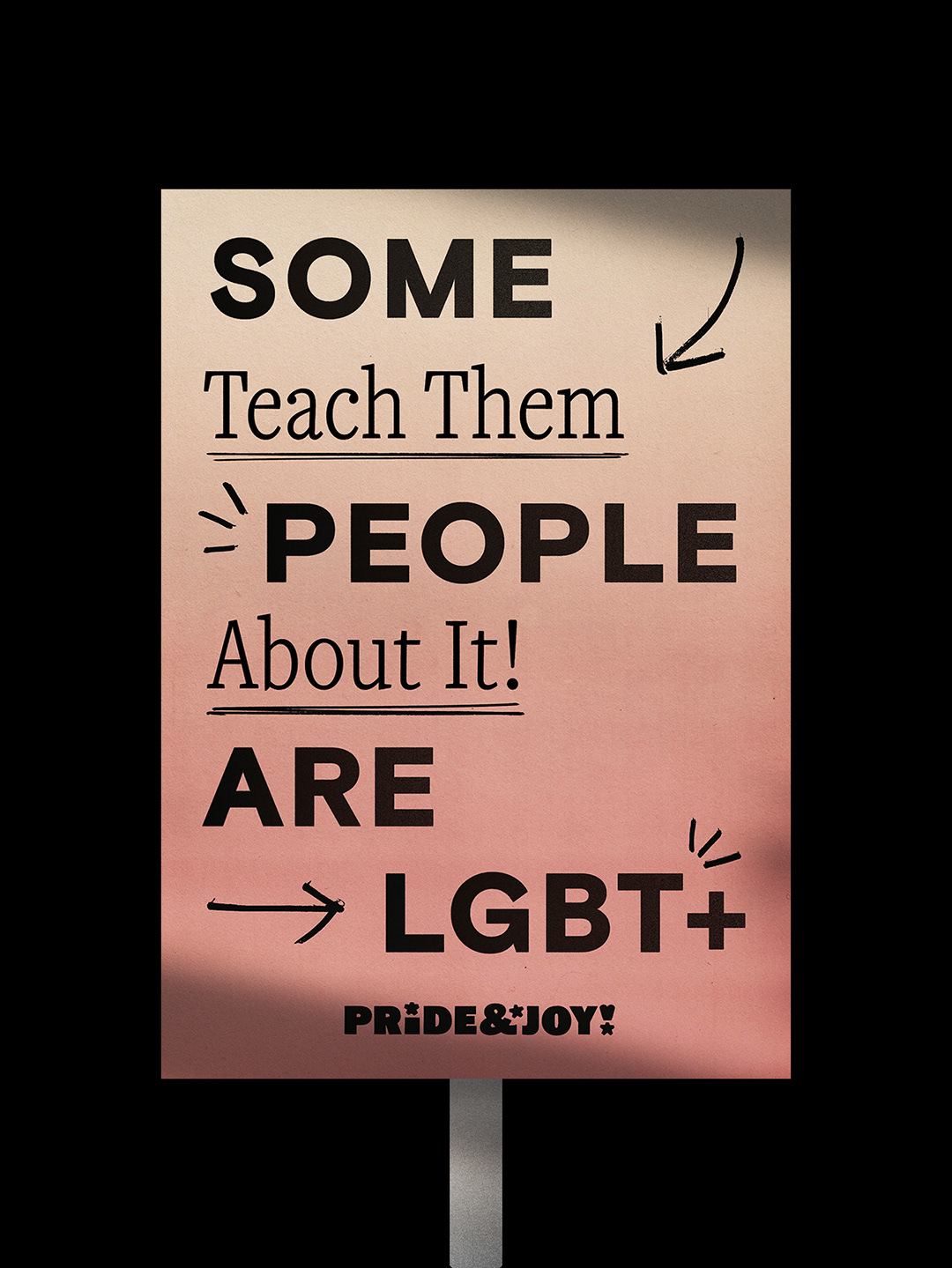
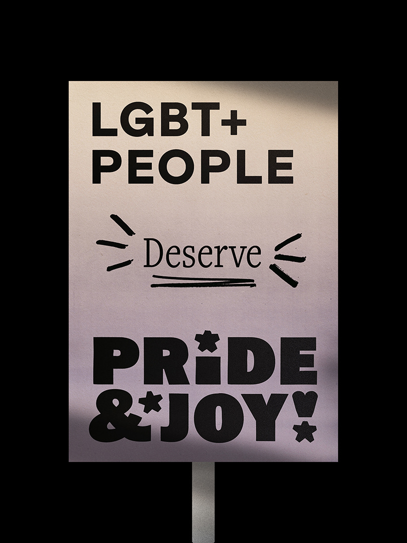
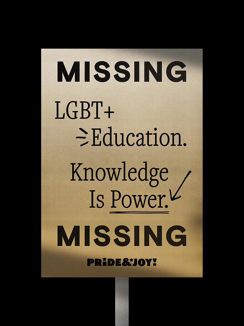
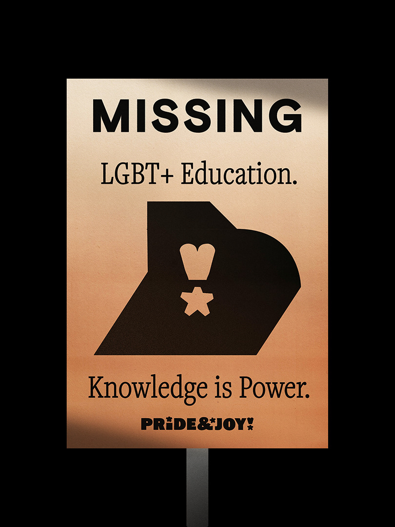
With the main educational resources developed, I sought to understand how the overall Pride & Joy brand could be adapted for more specific campaigns. This was studied through two sample series highlighting the lack of safe, reliable educational resources for LGBT+ teens: the first a parody of the Stonewall "Some People are Gay" campaign; the second, a "Missing" poster style campaign.


Protest placards with slogans highlighting the lack of safe and reliable LGBT+ education.
A protest banner promoting LGBT+ rights and the campaign.
The "Missing" campaign highlights the absence of and reliable LGBT+ education.
Business cards demonstrating the Pride & Joy brand in everyday use.