What I worked on:
Logo & Brand Design, Print, Digital Assets.
Tana Lawn is Liberty's proprietary cotton, developed to enhance their iconic fabric designs. I developed a symbol to represent Tana Lawn across labelling, branding and promotional purposes. This was no small task, with project stakeholders ranging from creative and marketing to the Liberty Fabrics design studio to international suppliers. The end result is a roundel which speaks to both Liberty's art nouveau heritage and it's position as a pioneer of future fabrics development.


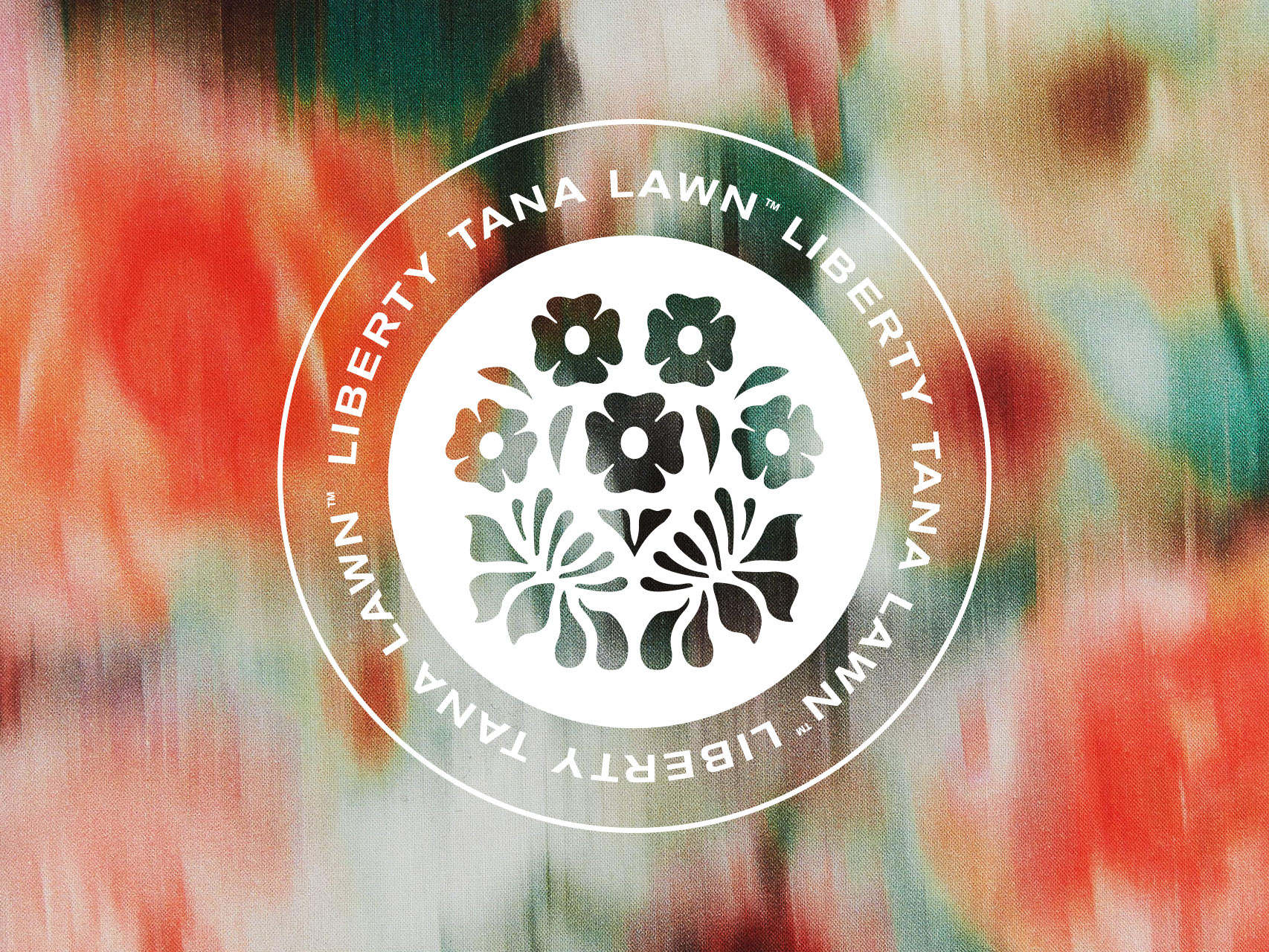
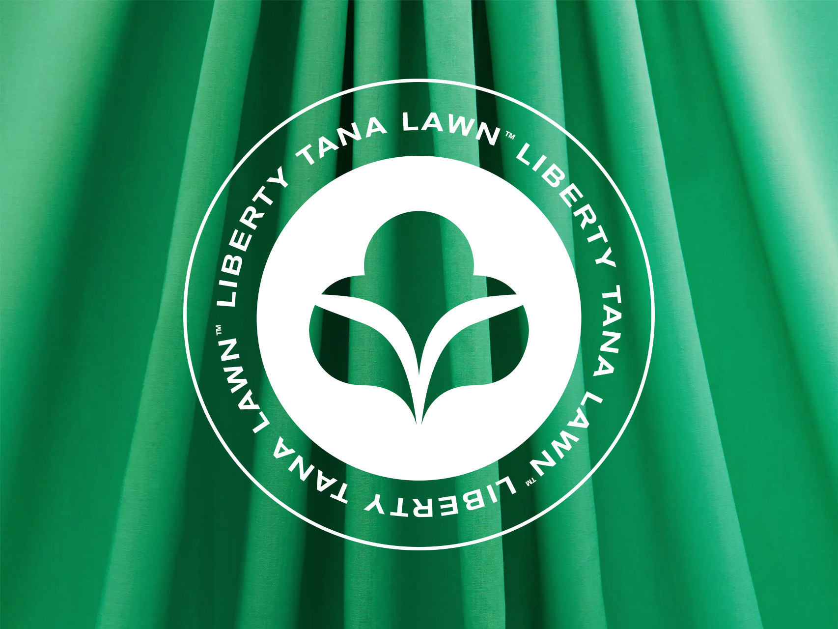
Three versions were created. Top: Large Format on Una Landscape Print; Bottom Left: Small Format on Hazy Days Print; Bottom Right: non-Liberty Symbol on Fern Plain Cotton).
Inspiration for the logo was taken from a range of sources, including the natural shape of cotton and the Tudor Revival architectural motifs found throughout Liberty's flagship store. A number of further symbols were then considered in development, including simple geometry, the shape of Lake Tana (from which Liberty's cotton is sourced), and fabric detailing such as buttons and stitching.
Inspirations and development for the Tana Lawn symbol.
The decision was taken to use Liberty's archival Persephone print as the basis of the symbol. I traced the image, before creating options with varying levels of simplification and abstraction, enabling stakeholders to consider how recognisable the print should be. The end result toes the line between ornament (a key aspect of Liberty's heritage) and simplicity (to enable the symbol's usability). A further version was then developed to use in very small formats, such as labelling.
The simplification process, from original print to final logo.
The symbol was put into use across a number of formats, ranging from the Liberty Fabrics website and The Liberty Book to trade show posters and instore swing tags. These use cases demonstrate the flexibility of the symbol across sizes, as well as how it interacts with the wider Liberty brand.
Instore swing tag featuring the symbol.
Posters for trade shows promoting Tana Lawn Cotton. Left Print: Thorpe; Right Print: Una Landscape
The Organic Tana Lawn logo featured in The Liberty Book.